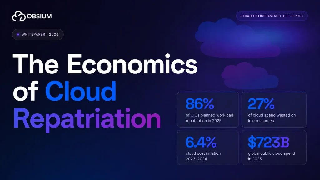


Wasted cloud spend hit 29% in 2026, rising for the first time in five years, with AI workloads a major driver (Flexera 2026 State of the Cloud Report). That same year, 98% of FinOps practitioners reported managing AI spend, up from 31% two years earlier (State of FinOps 2026).
So more teams are measuring more things, and waste went up anyway.
The problem is not that teams lack dashboards. It is that most FinOps dashboards report numbers pulled from a billing API because those are the numbers a billing API happens to expose. Nobody asks whether the number would change anyone’s behavior on a Tuesday.
This article covers the FinOps KPIs that actually drive decisions, where each one’s data comes from, which ones to track at your maturity stage, and which popular metrics are quietly useless.
Why most FinOps KPIs never change anything
A KPI earns its place if someone can look at it and know what to do differently. Most fail that test in one of three ways.
They’re lagging. Last month’s bill arrives three weeks after the money is gone. You cannot act on a receipt.
They have no owner. A cluster-wide waste percentage belongs to everyone, which means nobody wakes up thinking about it.
They only move in one direction. Cumulative savings achieved always goes up. A metric that cannot deliver bad news is a press release.
Shayna Woolf, a FinOps Advisor at Flexera, put the underlying issue directly:
“FinOps teams don’t have a data problem. If anything, they have more visibility than ever… But high savings don’t automatically mean a FinOps practice is running well. More often, they just reflect how much inefficiency existed in the first place.” — Strong FinOps metrics may not mean strong performance, Flexera
That last point deserves a second read. A team reporting a 40% savings rate might be doing brilliant work, or might have inherited an environment so wasteful that the first month of cleanup produced a huge number. The metric alone cannot tell you which.
| Lagging (reports the past) | Leading (predicts the future) |
|---|---|
| Monthly spend vs budget | Tagging compliance on new resources |
| Cumulative savings achieved | Rightsizing backlog age |
| Last quarter’s waste rate | Percentage of workloads with cost alerts configured |
| Commitment utilization at month end | Forecast accuracy trend over 6 months |
Track both. Just know which is which, and never build a quarterly narrative solely out of the left column.
Key insight: Before adding any KPI to a dashboard, answer two questions. Who owns this number? And what would they do differently if it moved 10% in the wrong direction? If either answer is fuzzy, the metric is decoration.
The four categories of FinOps metrics
Most KPI articles hand you a flat list of 15 or 20 metrics with equal weight. That is not how anyone actually works. Metrics fall into four groups, each answering a different question for a different person.
| Category | Question it answers | Primary owner | Data source |
|---|---|---|---|
| Visibility & allocation | Where is the money going? | FinOps team | Tags, FOCUS export, billing API |
| Rate optimization | Are we paying the right price? | FinOps + Finance | Billing API, commitment inventory |
| Usage optimization | Are we using what we pay for? | Engineering | Prometheus, cloud monitoring, kube-state-metrics |
| Business alignment | Is the spend producing value? | Leadership | Billing data joined to product analytics |
That last column is where most implementations break. Rate optimization metrics come from your bill. Usage optimization metrics do not. If your FinOps program only reads the billing API, half these categories are structurally unavailable to you.
Visibility and allocation KPIs
Allocation is the prerequisite. Every downstream metric is an estimate until you can attribute spend to a team, service, or product.
Cost allocation rate
Formula: (Allocated cost / Total cloud cost) × 100 Source: Tag coverage joined against your billing export Target: 90%+ before you trust any per-team reporting
This is the single most important number for a Crawl-stage team. Below 90%, your showback reports are guesses with decimal places.
Untagged resource percentage
Formula: (Untagged resource cost / Total cost) × 100 Source: Billing export filtered on required tag keys
Track this by resource creation date, not total inventory. Total inventory improves slowly and depressingly. New-resource compliance tells you whether your governance is actually working right now.
Shared cost percentage
Formula: (Cost that cannot be attributed to one consumer / Total cost) × 100
Networking, shared clusters, observability tooling, and platform services. Some shared cost is legitimate. A shared cost bucket north of 25% usually means the allocation model needs work, not that the architecture is unusually communal.
A concrete case. A company spending $400K a month with 62% allocation coverage has roughly $152K a month attributed to nobody. Their per-team dashboards are technically accurate and practically fiction, because the unallocated pool is larger than most of the individual team budgets they’re comparing.
Warning: Tagging compliance measured across your whole estate will always look bad and improve slowly, which makes it demoralizing and easy to ignore. Measure compliance on resources created in the last 30 days instead. That number responds to policy changes within a sprint.
Fixing allocation is unglamorous work: tag taxonomy, admission controllers, policy enforcement in CI. If you want a second opinion on your tagging model before you build reporting on top of it, Obsium’s cloud consulting team does this as a scoped engagement.
Rate optimization KPIs
Rate optimization asks whether you’re paying the best available price for the capacity you consume. This is where the most misread metrics live.
Effective Savings Rate (ESR)
Formula (FinOps Foundation): Cloud savings generated from rate optimization / On-demand equivalent spend Equivalent form: 1 − (Amortized cost / On-demand equivalent), per Flexera Source: Billing data, ideally FOCUS-normalized Origin: Introduced by ProsperOps and since adopted by the FinOps Foundation under its Rate Optimization capability
ESR is the honest rate metric because it accounts for everything at once: what you committed to, what you actually used, and what you wasted on unused commitments. Coverage and utilization each tell you one piece and can both look excellent while you overpay.
Commitment coverage and commitment utilization
Coverage: (Spend covered by commitments / Eligible spend) × 100 Utilization: (Commitment value consumed / Commitment value purchased) × 100
You need both, and neither is a target to maximize on its own.
| Metric | What it shows | What it hides |
|---|---|---|
| ESR | Actual reduction against on-demand pricing | A plateau caused by program maturity, not stalled effort |
| Commitment coverage | Share of eligible spend carrying a discount | Overcommitment leaving capacity stranded |
| Commitment utilization | How much committed spend you consumed | Legitimate architecture changes that orphaned commitments |
| Cloud spend trend | Where and how fast spend moves | Whether growth is healthy or waste accumulating quietly |
Adapted from Flexera
High coverage plus low utilization means you overcommitted. Low coverage plus high utilization means you left savings on the table. You need to read them together.
Warning: Setting commitment coverage as a team target is one of the most reliable ways to lose money in FinOps. Someone will hit 95% coverage right before an architecture migration strands the whole portfolio. Coverage follows workload stability. It does not lead it.
A note on benchmarking ESR
There is no universal good number. Early-stage teams post high savings rates from easy cleanup. Mature teams plateau because the easy waste is gone. A declining ESR in a mature environment usually means usage is growing faster than your optimization work can keep up with, which is a capacity planning problem.
Track the trend across six months alongside coverage and utilization. The trajectory is the signal.
Usage optimization KPIs
Rate optimization gets you a discount on capacity. Usage optimization asks whether you needed the capacity.
Resource utilization rate
Formula (compute): Consumed CPU hours / Allocated CPU hours Source: Prometheus, CloudWatch, Azure Monitor — not the billing API
Idle and unused resource percentage
Unattached volumes, inactive snapshots, orphaned load balancers, idle elastic IPs. Track each as a count and a cost. The count tells you whether cleanup automation is working; the cost tells you whether it matters.
Waste rate
Define this precisely or it becomes meaningless. Most teams say “waste rate” and mean three different things across three slides. Pick one definition and write it down:
- Provisioned-but-unused capacity cost, or
- Cost of resources with zero traffic over N days, or
- Both, reported separately
Ambiguous denominators are how a waste rate improves 8% in a quarter without anyone doing anything. We went through which optimizations actually move this number in FinOps best practices for cloud cost optimization.
Where Kubernetes breaks the model
Your cloud provider bills you for nodes. Your applications run as pods. Nothing in your billing data knows the difference.
The numbers here are stark. CAST AI’s 2026 benchmark across tens of thousands of production clusters found average CPU utilization at 8%, down from 10% the year before, and memory at 20%, down from 23% (CAST AI). Datadog’s 2024 State of Cloud Costs report found 83% of container costs associated with idle resources, split 54% cluster-level and 29% workload-level (Datadog).
For Kubernetes environments, four metrics matter more than anything in your bill:
- Request vs actual usage per pod. A pod requesting 2 cores and using 0.3 wastes 85% of its allocation. Multiply across hundreds of pods.
- Namespace-level consumption. This is how you do real cost allocation in a shared cluster.
- Node bin-packing efficiency. Are nodes full, or running at 30% because requests are spread badly?
- Cross-AZ network egress by service. Small per-gigabyte, large in aggregate, invisible without tracing.
All four come from Prometheus with kube-state-metrics and cAdvisor. If you run Kubernetes, this data already exists in your cluster. The question is whether anyone built the dashboard.
We wrote a deeper walkthrough of this in Kubernetes cost optimization: find and fix wasted compute. If you’d rather have someone build the Prometheus and Grafana layer with you, that’s a standard Obsium engagement.
Business alignment and unit economics KPIs
These are the metrics leadership actually asks about, and the ones most programs reach last. The 2026 State of FinOps survey found that mature practices increasingly focus on unit economics and AI value quantification rather than optimization and efficiency alone (State of FinOps 2026).
That shift is deliberate. J.R. Storment, Executive Director of the FinOps Foundation, described where the discipline has landed:
“FinOps has definitively expanded to a broad array of technology value management… As companies pursue transformation via AI, with the resulting increases in AI costs, FinOps practices will be critical to enable c-level decisions about multi-year strategic technology investments across infrastructure types.” — State of FinOps 2026 announcement, Linux Foundation
Practically, that means your KPI set is increasingly expected to answer investment questions rather than only reporting last month’s variance. 78% of FinOps teams now report to a CTO or CIO, up 18 points.
Cost per unit of value
Pick a denominator that matches how your business makes money:
| Business model | Useful denominator |
|---|---|
| B2B SaaS | Cost per active tenant, cost per seat |
| Marketplace | Cost per transaction |
| API product | Cost per 1,000 API calls |
| Media/streaming | Cost per hour delivered |
| AI product | Cost per successful task completed |
The FinOps Foundation places this in its Unit Economics capability, and the practical value is that it reframes every spend conversation. Total spend rising 20% while cost per tenant falls 15% is a company growing efficiently. The same 20% with flat unit cost is a problem.
Cloud cost as a percentage of revenue
Simple, boardroom-legible, and useful mainly as a trend. Compare against your own history rather than industry benchmarks, which vary so widely by business model that they’re close to meaningless.
Worth pairing with cost growth rate vs revenue growth rate — we covered why those two diverge in why cloud costs grow faster than revenue.
Forecast accuracy rate
Formula: ((Forecasted spend − Actual spend) / Forecasted spend) × 100
Track spend and usage forecasts separately. Getting the dollar number right while the usage forecast is wrong usually means two errors cancelled out, and they won’t next quarter.
What breaks first. A SaaS company defining cost per active tenant typically discovers their shared infrastructure allocation was never designed to divide cleanly by tenant. The database is multi-tenant, the Kubernetes cluster is shared, and the observability bill is one line item. Getting to a defensible per-tenant number is mostly an allocation modelling exercise, not a measurement one. Budget accordingly.
Tip: Do not attempt unit economics before allocation coverage passes 90%. You will produce a number, leadership will put it in a deck, and you will spend the next two quarters explaining why it moved.
AI and GPU cost KPIs
Almost every KPI framework written before 2025 misses this entirely, which is a problem when 98% of practitioners now manage AI spend.
GPU utilization rate
The same CAST AI research that found 8% CPU utilization found GPU utilization at 5%. Given that GPU instances cost several times their CPU equivalents, this is now the most expensive underutilized resource in most environments.
Cost per 1,000 tokens (or per inference)
The normalized unit for comparing model costs across providers and deployment types. The FinOps Foundation’s AI guidance treats cost per 100K tokens as the core unit metric for API-based AI spend.
Cost per successful task
More useful than cost per call. If your agent retries three times before succeeding, cost per call looks fine while cost per outcome is 3x what you budgeted. This is the AI-era equivalent of measuring provisioned capacity instead of used capacity.
AI spend as a percentage of total cloud spend
A simple ratio that answers the question executives are asking anyway, and it establishes the baseline you’ll need when someone asks whether AI spend is “under control.”
| Traditional cloud KPI | AI/GPU equivalent |
|---|---|
| CPU utilization rate | GPU utilization rate |
| Cost per compute hour | Cost per 1,000 tokens |
| Idle resource percentage | Idle GPU hours (allocated, no active job) |
| Cost per transaction | Cost per successful task |
| Commitment coverage | Reserved GPU capacity vs on-demand |
If you’re standing up cost visibility for GPU and inference workloads, Obsium works on observability for AI systems specifically because the standard billing tooling wasn’t built for it.
Which KPIs to track at each maturity stage
Here’s the part most articles skip. The FinOps Foundation’s own research notes that almost nobody reaches Run maturity across all capabilities (There Are No Runners). Tracking Run-stage metrics from a Crawl-stage foundation produces confident numbers built on incomplete data.
| Stage | Track these | Skip for now | Why |
|---|---|---|---|
| Crawl | Cost allocation rate, untagged percentage, budget variance, idle resource cost | ESR, unit economics, AI cost efficiency | You cannot optimize what you cannot attribute |
| Walk | Everything above, plus ESR, commitment coverage + utilization, resource utilization rate, forecast accuracy | Full unit economics, cost per feature | The largest absolute savings live in this tier |
| Run | Everything above, plus unit economics, cost per successful task, AI cost efficiency, pre-deployment cost estimates | — | Requires business data that lives outside the billing system |
Most teams reading this are Walk-stage, and would get more money back from fixing commitment utilization than from building a cost-per-customer model. Unit economics makes the better slide. Utilization usually makes the bigger difference to the bill.
Building a FinOps dashboard people actually open
The most common dashboard failure is building one view for three audiences. An executive, a FinOps analyst, and a backend engineer need different numbers at different refresh rates, and merging them produces something nobody uses.
| Audience | Metrics they need | Refresh cadence |
|---|---|---|
| Executive / CFO | Cost per unit of value, cloud cost vs revenue, spend vs budget, AI spend share | Monthly |
| FinOps team | ESR, coverage, utilization, allocation rate, forecast accuracy, anomaly count | Weekly |
| Engineering team | Their namespace cost, request vs usage, idle resources they own, cost anomalies on their services | Daily / real-time |
The engineering view is the one that changes behavior, and it’s the one most organizations never build. A team that sees its own namespace cost trending up on a Monday can fix it that week. A team that sees a company-wide chart in a monthly meeting cannot fix anything.
Dashboard sanity checklist:
- [ ] Every metric has a named owner
- [ ] Every metric has a documented formula and data source
- [ ] Engineering teams can see their own costs without asking anyone
- [ ] At least one metric is a leading indicator
- [ ] Anomaly alerts route to the team that owns the workload, not to a shared inbox
- [ ] Container-level data comes from cluster metrics, not billing estimates
- [ ] Someone can explain what each number means without opening a spreadsheet
If more than two are unchecked, you have a reporting tool that nobody operates from. Obsium builds these on Prometheus and Grafana so the cost view sits next to the reliability view engineers already have open.
KPIs that waste your time
| Metric | Why it misleads | Track instead |
|---|---|---|
| Cumulative savings achieved | Only goes up, rarely audited, never triggers a decision | ESR trend over 6 months |
| Number of recommendations generated | Measures your tool’s verbosity, not your performance | Percentage of recommendations actioned within 30 days |
| Recommendations actioned (no denominator) | 200 actioned out of 8,000 looks identical to 200 out of 210 | Action rate with the denominator visible |
| Raw month-over-month spend change | Growth and waste look the same | Spend change per unit of business volume |
| Cost per employee | Headcount has no causal relationship to cloud spend | Cost per active customer or transaction |
| Total number of KPIs tracked | Genuinely used in maturity self-assessments | Number of KPIs with a named owner |
Cumulative savings deserves special mention because it’s the most common headline number in FinOps reporting. It’s calculated by summing every optimization anyone claimed since the program started, it’s almost never validated against actual bills, and it has never once caused a team to change what they’re doing.
Setting targets without inventing them
Collect at least three months of data before setting any target. Targets set in month one become the number the team optimizes for rather than the outcome you actually wanted.
Prefer improvement rates to absolute values. “Increase allocation coverage by 5 points this quarter” beats “hit 95% coverage,” because the second is either trivially easy or impossible depending on where you started, and you won’t know which until you’ve already committed to it in a QBR.
Be skeptical of vendor benchmarks. Percentile rankings published by a vendor measure the customers who bought that vendor’s product, which is a self-selecting group. Your own history is a better comparison, and FinOps Foundation community data is a reasonable outside check.
| Cadence | Review these |
|---|---|
| Daily | Cost anomalies, budget burn rate on active projects |
| Weekly | Commitment utilization, idle resource count, rightsizing backlog |
| Monthly | ESR, coverage, allocation rate, forecast accuracy, spend vs budget |
| Quarterly | Unit economics, cost vs revenue growth, KPI set itself |
Review the KPI set quarterly too. Metrics that stopped triggering decisions should be retired, and most dashboards accumulate rather than prune.
What to take away
Three metrics with owners beat twenty on a dashboard. That’s the whole argument, but a few specifics are worth repeating:
- Allocation rate is the gate. Below 90%, every other number is an estimate.
- ESR is the honest rate metric. Coverage and utilization can both look great while you overpay.
- Billing data cannot see inside a Kubernetes node. With average CPU utilization at 8%, that blind spot is expensive.
- Unit economics is what leadership actually wants, and the last thing most teams get to. That ordering is correct.
- AI broke the old playbook. GPU utilization at 5% and cost per successful task are now table stakes.
- Cumulative savings achieved is a vanity metric. Retire it.
- Match KPIs to maturity. A Crawl-stage team reporting unit economics is reporting fiction.
The metric that matters is the one that changed a
Where Obsium fits
Most teams we work with don’t have a measurement problem in the abstract. They have a billing dashboard that stops at the node boundary and no way to see what their workloads actually consume.
If that sounds familiar, book a free 30-minute consultation. No sales deck. An engineer will look at your stack and tell you which three metrics are worth building first.
FAQs
What are the most important FinOps KPIs?
Cost allocation rate, effective savings rate, commitment coverage and utilization, resource utilization rate, and at least one unit economics metric. Allocation rate comes first because everything else depends on it.
What is a good effective savings rate?
There’s no universal benchmark. Early-stage teams often post high rates from easy cleanup; mature teams plateau because the obvious waste is gone. Judge the six-month trend alongside coverage and utilization rather than the number in isolation.
How many FinOps KPIs should we track?
Five to eight with real owners beats twenty on a dashboard. Add a KPI only when you can name who owns it and what decision it informs.
What’s the difference between a FinOps metric and a FinOps KPI?
Metrics are the raw numbers you can pull. KPIs are the metrics your team has decided matter enough to set targets against and report on regularly. Most dashboards are full of metrics wearing KPI badges.
How do you measure FinOps ROI?
Compare realized savings against fully loaded program cost, including tooling and headcount. Validate savings against actual bills rather than tool-estimated figures. Then add avoided cost from anomalies caught early, tracked separately so nobody conflates the two.
What KPIs should we report to the CFO?
Cost per unit of value, cloud cost as a percentage of revenue, spend versus budget with variance explanation, and AI spend as a share of total. Four numbers. Not the whole dashboard.
How do you track FinOps KPIs for Kubernetes?
Billing data stops at the node. Pod-level and namespace-level metrics come from Prometheus with kube-state-metrics and cAdvisor. Multiply namespace resource consumption by your per-unit node cost to get workload-level cost allocation.
How do you measure AI and GPU cost efficiency?
GPU utilization rate, cost per 1,000 tokens, cost per successful task, and idle GPU hours. Cost per successful task matters most for agentic workloads, where retries make per-call cost look better than reality.decision last quarter. If you cannot point at one, the dashboard is decoration no matter how good it looks.